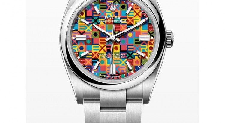
For a brand that built its reputation on restraint, Rolex has become noticeably more comfortable with color lately.
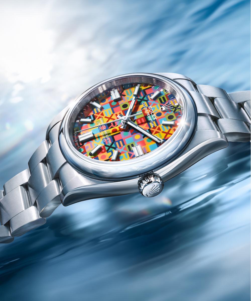
Not wild experimentation exactly — this is still Rolex, after all — but the tone has shifted. Over the past few years we’ve seen puzzle-piece Day-Dates, Celebration dials, emoji-inspired off-catalog pieces, and now, for Watches & Wonders 2026, the return of something collectors have quietly hoped would come back for years: the Jubilee Dial.
Only this time, Rolex pushed it much further than it ever did in the 1970s.
The new Oyster Perpetual Jubilee Dial models arrive as part of the broader celebration surrounding the 100th anniversary of the Oyster case, arguably the single most important design in Rolex history. Instead of commemorating the occasion with a massive limited edition or some overly theatrical complication, Rolex did something more interesting. It leaned into pattern, texture, nostalgia, and color. 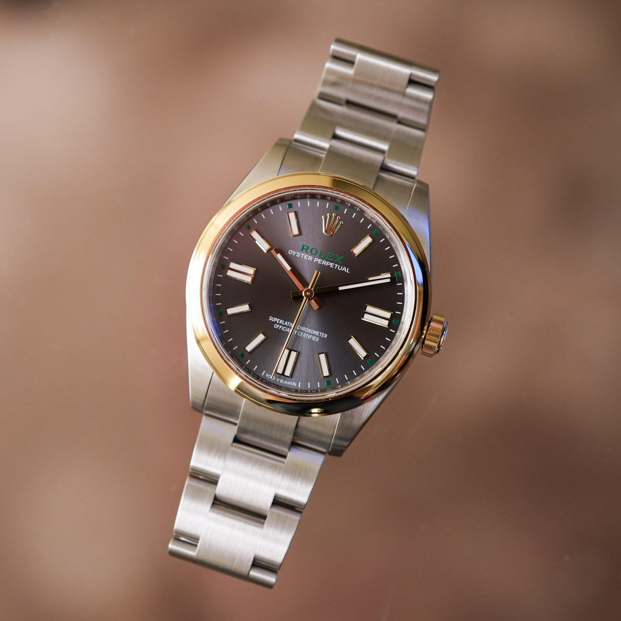
Honestly, it works better than expected.
The Jubilee Dial Returns — But This Isn’t Really A Vintage Reissue
Back in the 1970s, Rolex experimented with repeated logo patterns across the dial surface — a surprisingly bold move for a company that usually avoided decorative excess. Vintage examples have since become cult favorites, partly because they feel so unlike modern replica Rolex design language.
The 2026 interpretation keeps the core idea but modernizes almost everything else.
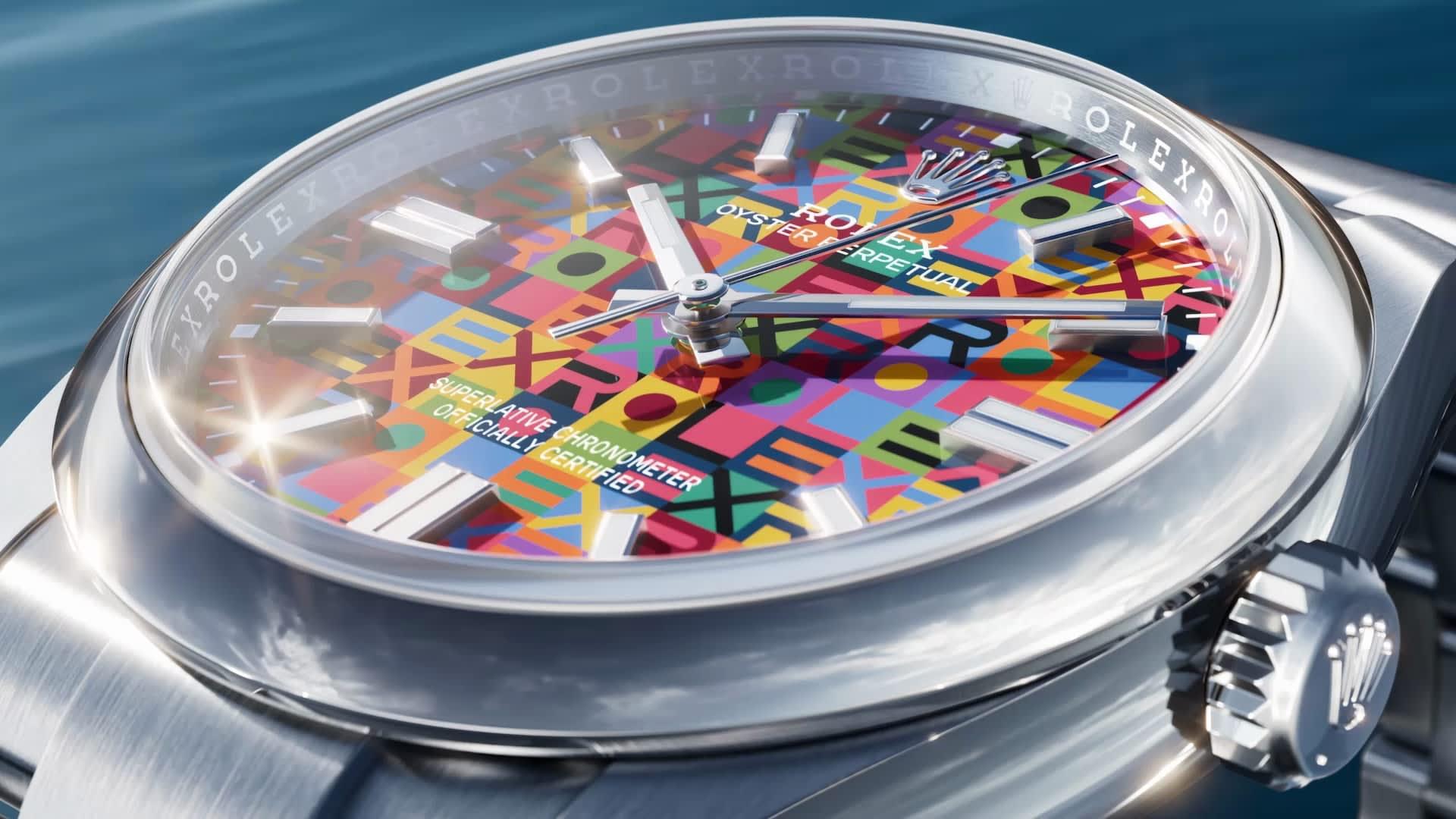
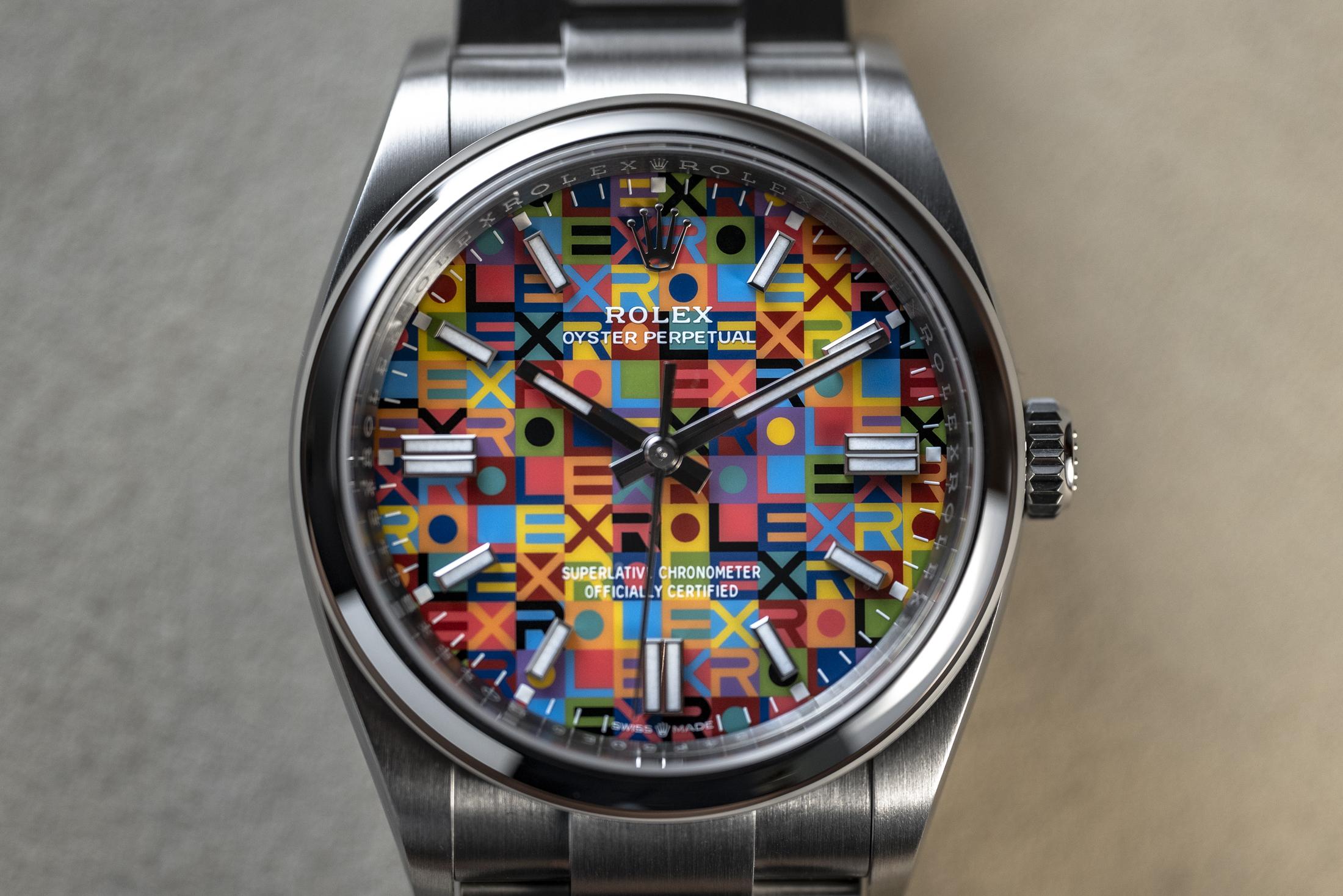
Rather than using a single repeated tone, Rolex applies the logo motif in ten different lacquer colors layered one after another to create the final pattern. That sequential application process sounds painstakingly slow, and it probably is. Multi-color lacquer work tends to expose tiny imperfections immediately, especially under bright lighting.
The result feels somewhere between celebratory and oddly sophisticated.
In photos, the dial almost looks playful. In closer macro shots, though, there’s a surprising amount of depth and structure. The colors shift subtly rather than screaming for attention all at once.
That restraint matters
Because this could’ve gone very wrong.
| Model | Reference | Movement | Power Reserve |
|---|---|---|---|
| Oyster Perpetual 41 | Ref. 134300 | Caliber 3230 | 70 hours |
| Oyster Perpetual 36 | Ref. 126000 | Caliber 3230 | 70 hours |
| Oyster Perpetual 31 | Ref. 277200 | Caliber 2232 | 55 hours |
Rolex Is Quietly Becoming Less Conservative
This is probably the bigger story here.
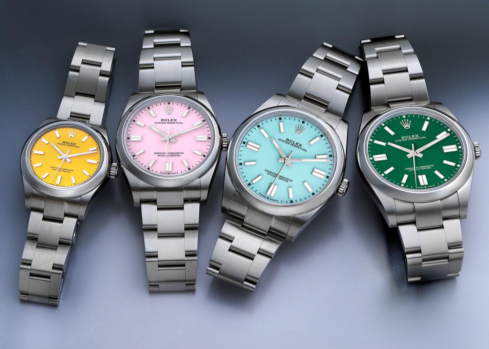
For decades, Rolex treated color cautiously. Even bright Stella dials from the past existed on the edges of the catalog rather than at the center of it. Modern Rolex, though, seems increasingly comfortable allowing personality into traditionally conservative collections.
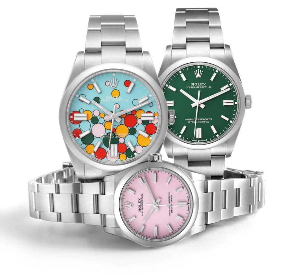
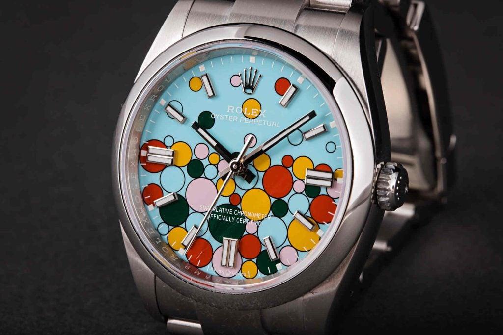
The Celebration Dial already hinted at this shift. The Puzzle Dial Day-Date pushed it further.
Now the Jubilee Dial feels like Rolex finding a middle ground between playful experimentation and mainstream commercial appeal.
Importantly, these watches are still standard Oyster Perpetuals underneath:
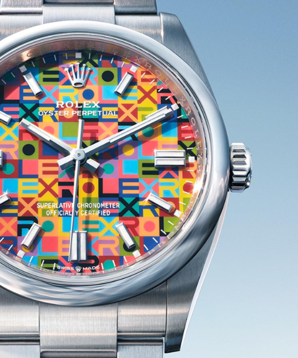
- Oystersteel cases
- 100 meters of water resistance
- smooth bezels
- Oyster bracelets
- Twinlock crowns
- simple time-only layouts
Nothing about the underlying architecture changes.
And honestly, that’s probably why the colorful dial works. Rolex resisted the temptation to over-design the rest of the watch.
The Jubilee Dial Might Age Better Than The Celebration Dia
This may end up becoming a slightly controversial opinion among collectors, but the new Jubilee Dial has a better chance of long-term aging than the Celebration Dial it effectively replaces.
Why?
Because the pattern feels integrated into the identity of the watch instead of sitting on top of it.
The Celebration Dial was intentionally loud. Fun, absolutely. But also highly trend-driven. The Jubilee Dial feels more rooted in Rolex history, even if the execution is dramatically modernized.
There’s also more visual rhythm here. The repeated logos create texture rather than simply relying on bright circular accents.
Some collectors will still hate it, naturally.
That almost guarantees strong demand.
The “Oyster 100” Is Rolex At Its Most Restrained
Where the Jubilee Dial models lean colorful and expressive, the Oyster 100 is subtle almost to the point of understatement.
And that’s probably intentional.
The watch arrives in a restrained two-tone Rolesor configuration pairing Oystersteel with yellow gold, but Rolex avoids the flashy polished center links typically associated with modern two-tone sports models. Instead, the bracelet remains almost entirely brushed steel.
That decision changes the entire personality of the watch.
Normally, two-tone Oyster Perpetuals can feel slightly dressier than the collection perhaps wants to be. Here, the brushed finish keeps the watch grounded and surprisingly clean-looking.
The slate gray sunburst dial helps too.
Then Rolex adds tiny flashes of deep green:
- the Rolex wordmark at 12
- minute track accents
- subtle anniversary cues
Nothing feels excessive. Even the “100 Years” text at 6 o’clock avoids becoming overbearing.
Which is impressive, honestly, because anniversary watches often become design disasters very quickly.
| Feature | Oyster Perpetual 41 “Oyster 100” |
|---|---|
| Case Size | 41mm |
| Thickness | 11.6mm |
| Material | Oystersteel + Yellow Gold |
| Movement | Caliber 3230 |
| Power Reserve | 70 hours |
| Water Resistance | 100m |
| Bracelet | Brushed Oyster bracelet |
The Movements Stay Familiar — And That’s Probably The Right Decision
Rolex wisely avoided turning these releases into technical showcases.
The larger models use the Caliber 3230, while the 31mm version receives the Caliber 2232. Both movements are already well-established inside Rolex’s lineup and remain among the most dependable time-only calibers currently in large-scale Swiss production.
The Caliber 3230 continues to use:
- Chronergy escapement
- blue Parachrom hairspring
- 70-hour power reserve
- Superlative Chronometer certification
Meanwhile, the smaller 2232 incorporates Rolex’s Syloxi silicon hairspring and a slightly shorter 55-hour reserve.
Could Rolex have debuted something entirely new for the Oyster centennial? Probably.
But there’s something fitting about Rolex celebrating the Oyster case with refinement instead of reinvention. The Oyster line was never really about mechanical theatrics anyway. Its significance came from durability, practicality, and consistency.
The modern Oyster Perpetual still reflects that surprisingly well.
These Watches Say Something Interesting About Modern Rolex
For years, collectors criticized Rolex for being too cautious creatively.
Now the criticism may slowly reverse.
Because these recent releases — Celebration dials, Puzzle dials, enamel Daytonas, Jubilee dials — suggest Rolex is becoming more willing to experiment emotionally rather than mechanically.
That’s an important distinction.
The core engineering remains conservative, even rigid in some ways. But visually, fake Rolex seems increasingly comfortable introducing watches that spark reactions instead of simply replacing previous references quietly.
And perhaps the most interesting part is that none of these 2026 Oyster releases feel desperate for attention.
The Jubilee Dial could’ve become cartoonish. The Oyster 100 could’ve become an overly sentimental anniversary piece. Somehow Rolex avoided both traps.
